Remember Me Not, MyLowes?
MyLowes is a pretty good idea. It lets you keep track of the products you buy at the giant hardware store (which comes in handy more than you might think). All you have to do is have the cashier scan your card when you check out. Even better, the mobile app can display your bar code so you don’t have to carry a card around. (I hate carrying loyalty cards around.)
Unfortunately, I kept finding myself signed out of the app when I came up to the cashier, frantically trying to type in my email address and copy and paste my password from 1Password to log back into the app. I didn’t understand why I kept getting logged out. The app clearly said it was going to remember my login.
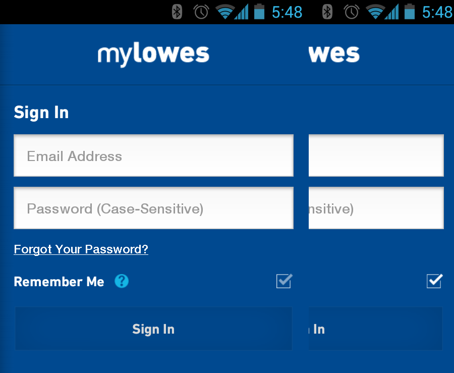
The image on the left shows what the Remember Me checkbox when it’s deselected. The image on the right shows the checkbox selected. The only difference, of course, is that the selected widget is slightly brighter than the unselected widget. Why is there a prominent check mark in the unselected widget when a check mark clearly means selected? If you have never selected the widget, you wouldn’t know the difference. On top of that, the widget is far smaller than the design guidelines for touch screens.
For contrast, here’s what the standard Android and iOS checkbox widgets look like:
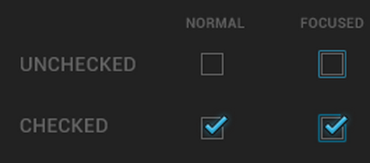
No ambiguity. Easily touchable size. So why use a non-standard control to make things harder to use?