Final Markup Design
I’ve discussed the design we worked for my user-centered design class in a few previous posts. As we’ve wrapped up the class this week, I thought I’d share our design and some thoughts on the process.
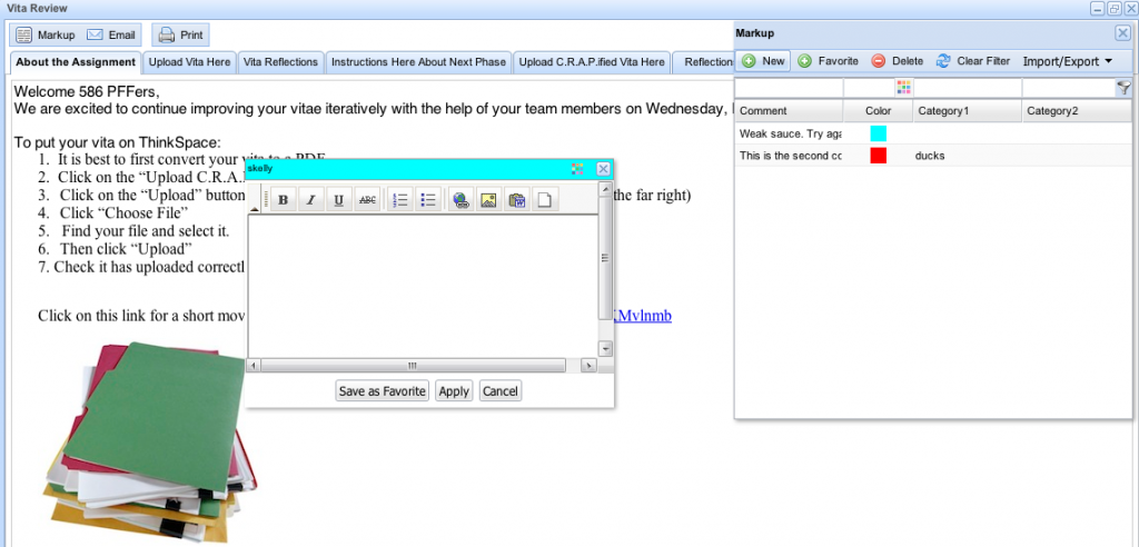
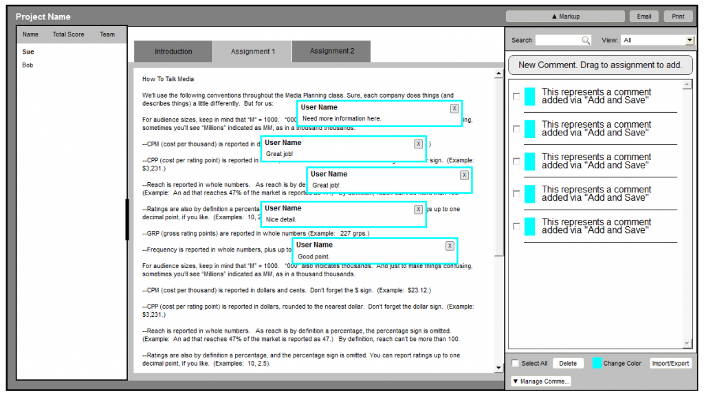
Here’s a look at the current state of the system:
The main interactions are adding new comments and dragging saved comments to the assignment. This part worked well, but there were several areas in need of improvement:
- Too much information density in the comment list and not enough of the comment displayed. Users had to fiddle around with the spreadsheet-like layout to get the right information to meet their needs.
- The window floats over the assignment and thus had a tendency to get in the way; the window often blocked comments on the page.
- Saved comments can have several categories added, but users had to remember if they added a category to Category1, Category2, etc.
- Managing comments was so complicated that users tended to export their comment lists to CSV files and manage the comment list in Excel rather than in the application.
Our overall design goals were to simplify the presentation of information and make managing comments more simple. Here’s what we came up with after several rounds of prototypes and several rounds of usability testing.
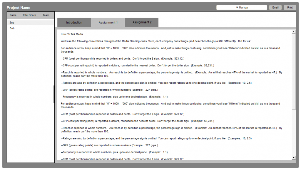
First we anchored the comment window to the right side of the screen to remove the issues with the comment list overlaying comments on the page. We also moved the button that opens the window to the right side of the screen where the window appears. Proximity indicates that the button is related to the window and Fitts’ law would indicate that if users wanted to use Markup, we should open the window close to their cursor.
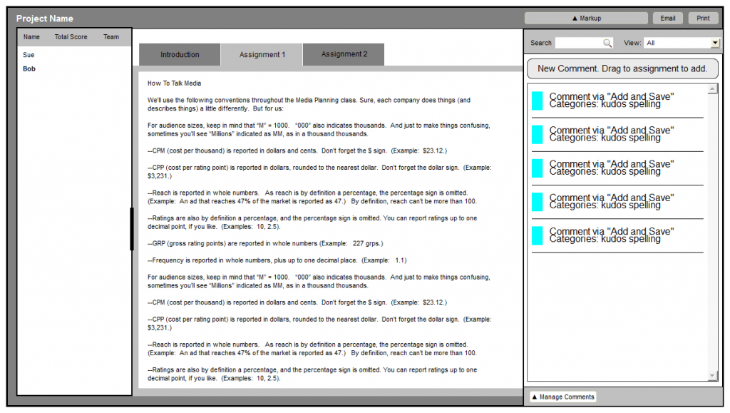
After opening the Markup window, you can see a much simplified presentation of the comment list.
We got rid of the spreadsheet layout so we could show more of the comment text and the categories. We replaced most of the functions at the top with a single search field, a show category selector, and great big button that users can click or drag onto the assignment to add a comment. Some either key changes:
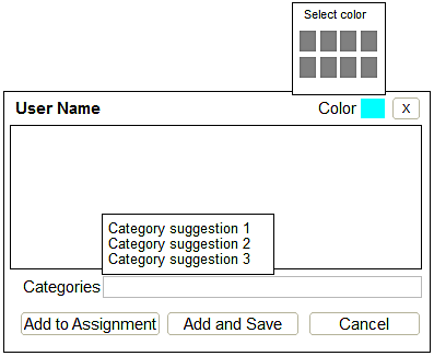
- We tried to fix some of the memory issues related to categories. Categories no longer need to be added to a specific database field so users don’t have to remember which field a category is listed in. We also added a category suggestion display to the category field so matching categories will display as a user types.
- You no longer use a separate window to save a comment than you do to add a comment to an assignment. This seems simple and obvious when you consider the design outside of the implementation. One of my users commented on this feature in a test, “You just made my day!”
Finally, we separated the management tasks into a different area of Markup. Our initial research suggested that this was conceptually a different task to users.
Comments can be selected for managing using a checkbox. This is more obvious than the current method of Ctrl/Cmd clicking. Several of our testers didn’t even know you could select multiple comments in the current version of the software.
We did keep the Import/Export function because it is also used for sharing comment lists among users (which is fairly common among our participants); however, we think designing a sharing feature to enable this in the application would be a good future step.
